a cat & his boy
Creating Satisfying Cover Art
Graphic design is not my forte... However I'm beginning to see the fun of it! Let me show you how I came up with the cover art for my just to be released Gameboy game.
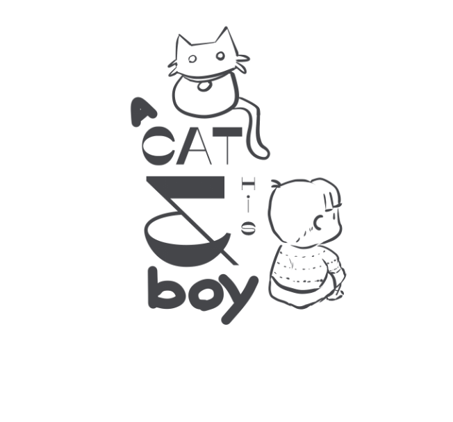
Step one: I wanted the title of the game to be the focal point of the design. I tried to make it look appealing but wanted it to potentially require a second look. After trial and error, this is what I settled on:
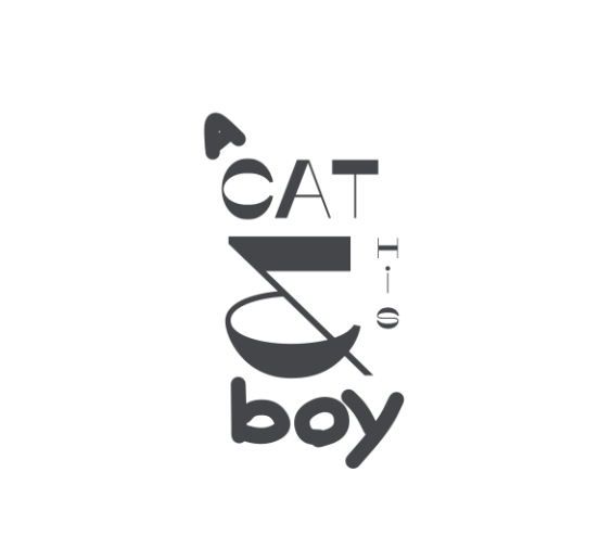
I decided on a design that favored a more vertical box shape since I would be using this design on the label for a Gameboy cartridge. The more rectangular text would give me wiggle room on the borders of the canvas to have some fun with. After all a GB cartridge label is only about an inch and a half on each dimension and "a cat and his boy" is a mostly dialogue dependent game. Since we are dealing with dialogue to drive this game, a big font on the label gives a feeling that this game is about words first and everything else second and third.
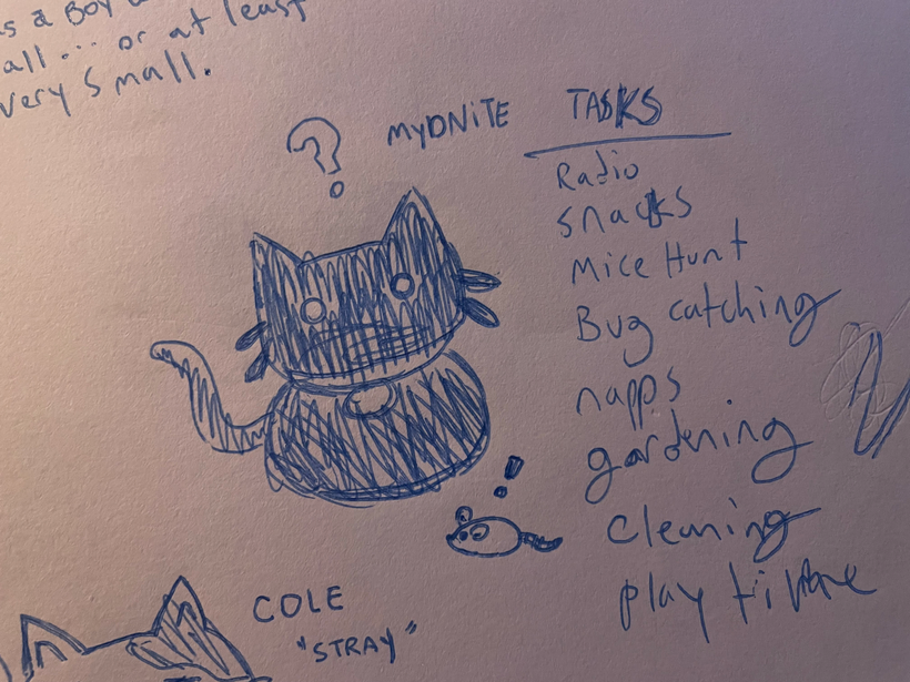
Step Two: Time to bring the two main characters to the stage. Buried in my memory I knew there was a concept doodle of the main character "Midnight" in one of my sketchbooks. I really liked this sketch and thought it matched the character well. So that was easy.
What about the boy? Leif is his name and I really didn't have any doodles of him that were interesting enough to show his personality at a glance. Usually I like to exclusively sketch on real paper however, the hour was late... I guess I'll sketch on the computer. This was the rough result of that:
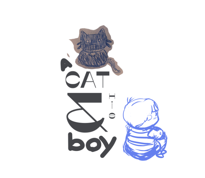
Yay! I had a concept I liked! Was it rough looking? Naturally. Did it have potential? Hopefully...
Step Three: Outlines and Polish. Time for the elbow grease.
At this moment, I felt like I could see the end result and that I was liking the direction it was going. I felt already the mood of the game and the personality of the characters was shining through the design.
Step Four: Coloring books were just training for digital art and I didn't know it.
To be honest... I hesitated for way too long on how to color this. The main reason being. The game is entirely and on purpose in black and white AKA 1-bit. Did I really want to break that discipline here? On the cover art of all things? I thought for a long time about just doing tone dots like a newspaper or just making it all grayscale. But ultimately I decided to use small accents of colors within the grayscale and tone dots. Below is some options I made.
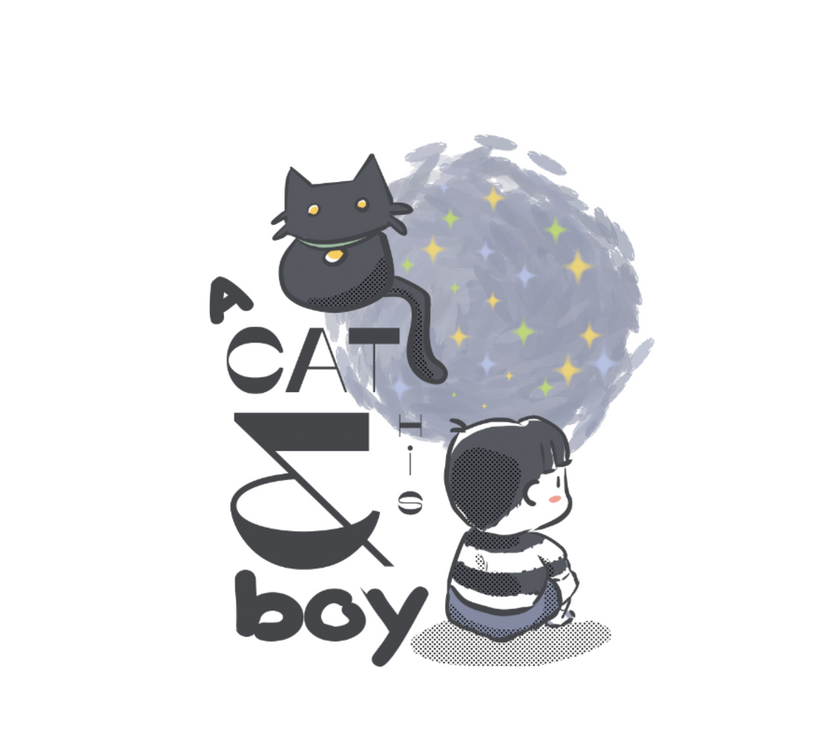
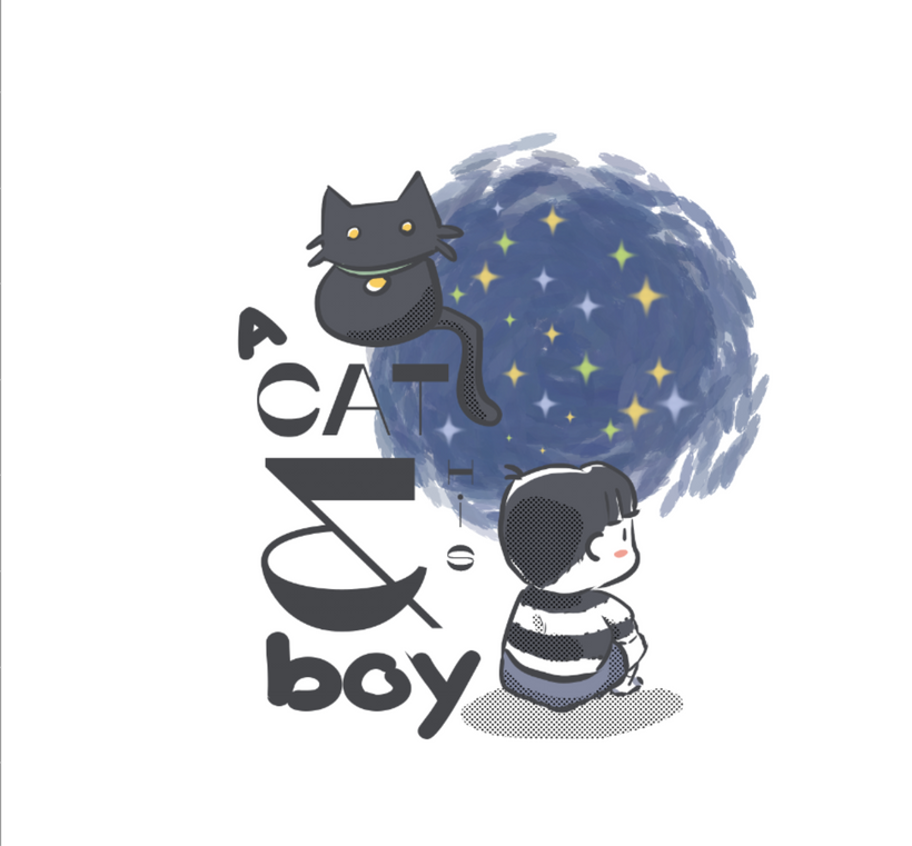
I liked this swirl of chaotic paint but I decided against the paint swirl because
1) I didn't want it to seem like a reference to Van Gogh or to draw unnecessary comparisons to his work.
2) The swirl felt very open ended, which can be an excellent artistic expression at times, but it was not what I was going for this time.
3) Crucially, the swirl obscured the simple and crisp design into more of a blob than an attractive bit of graphic design on a tiny Gameboy game.
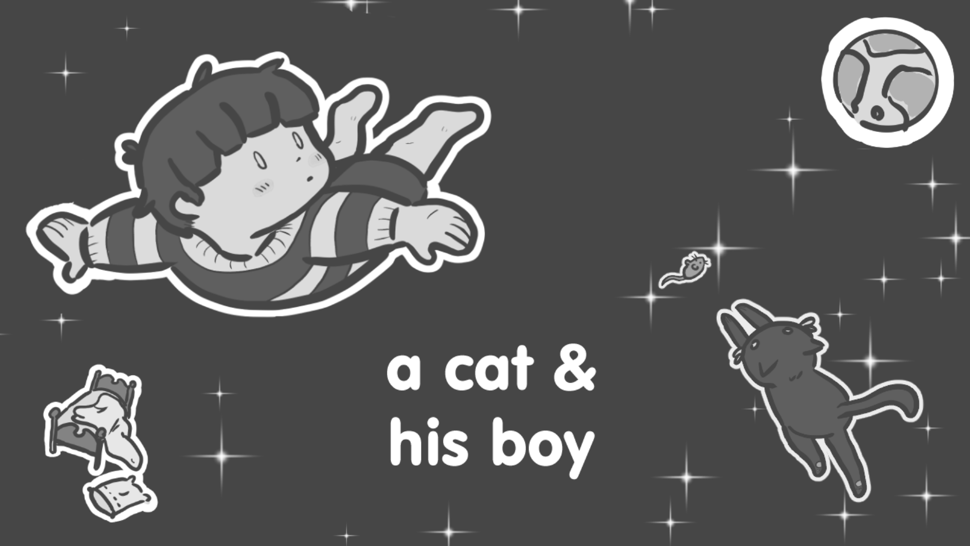
In conclusion, I had a ton of fun drawing this and am happy with the final result (Below Paragraph) and feel it portraits the emotion of the game in one image. I am looking forward to selling a small run of physical copies very soon. If you would be interested in buying a physical cartridge when they are ready please let me know :D
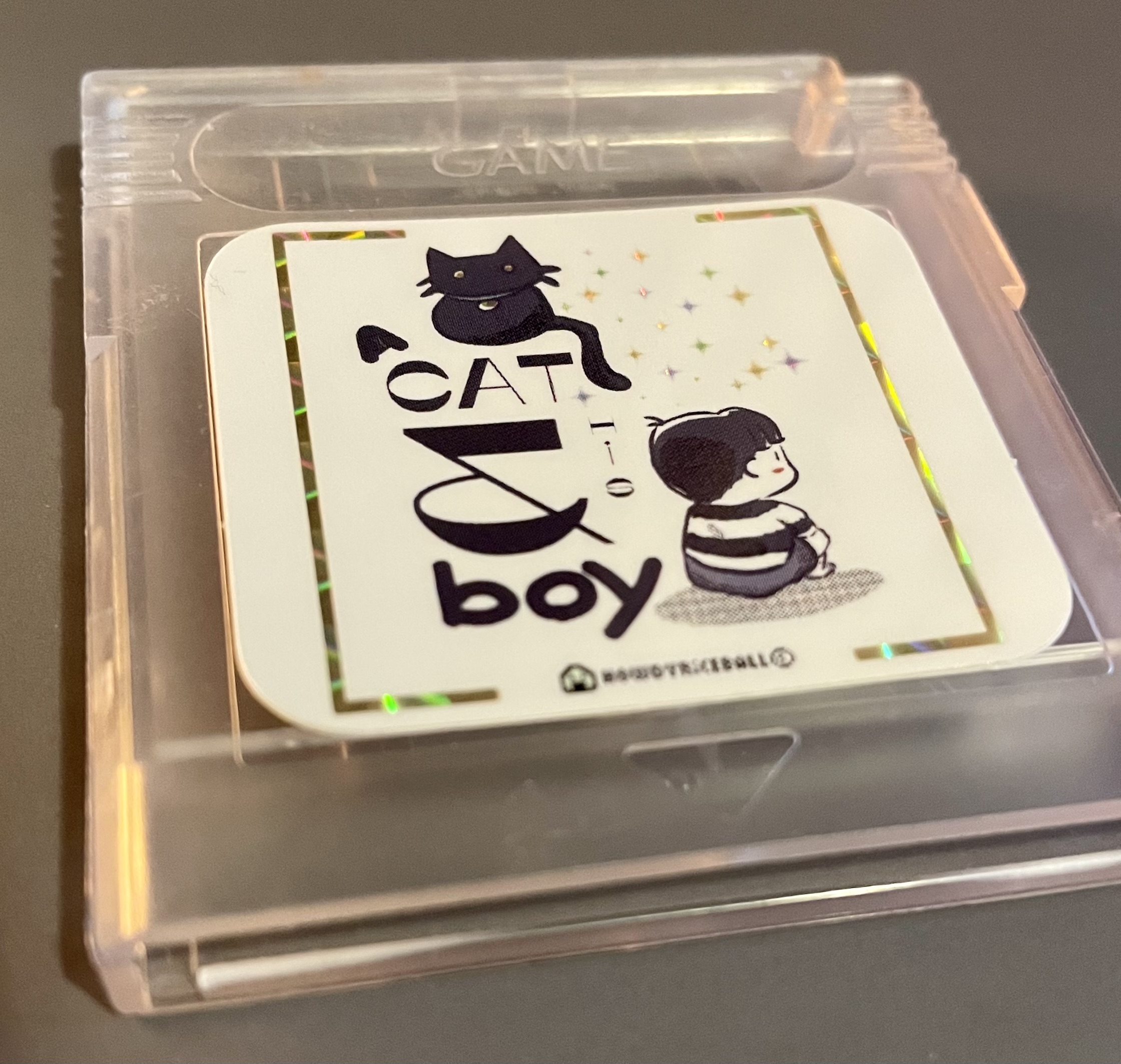
That was my thought process and decision making while crafting what is most likely the first impression most people will have of the game.
Have you got a chance to play the game since it launched? Please check it out! It is a very cozy game.
Peace
howdy riceball
Comments
Log in with itch.io to leave a comment.
Really dig the look into the process here.
I think that the decision to bring in color is definitely the right choice here! I can relate to basing creative decisions on a core element or theme and am trying to get better at seeing where I can stray from the strict boundaries while still embodying the element/theme (in this case, the small accents of muted color working well).
Did it take some trail and error for placement of the cat and boy? Imo, the layout works very well to the tone of the game. Having Midnight be higher up than Leif and looking at the viewer gives the impression to me that the cat is quite literally on top of things while Leif is (pun intended) spacing out. I also like that the fonts follow with their respective characters.
Thanks for your kind words Eric! I'm happy to share a bit of the process, I've been trying to be better about taking more screenshots along the way so I can share more later.
I have that struggle also, sometimes I am so wrapped up in what I'm working on it can be hard to tell if it is any good or not. But I do love self imposed boundaries on creative decisions because without them there is too many options and that can really muddy the creativity (at least for me)
haha I love those puns! And they are accurate to the characters as well! I did want there to be this distance between the characters in the illustration. I wanted it to be clear that Leif needs Midnight but the opposite isn't necessarily true, although Midnight does protect Leif.