Where Past & Future Meet (Part TWO)
(Part ONE) (Part TWO) (Part THREE)

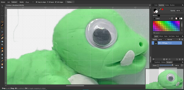
Look at the fear in his prehistoric googly eyes... He knows he's about to get edited.
The first order of business was to remove the background from the photo I took so that I can place him over other images that can act as a fake environment for him to be in.
Then I tried a ton of potential backgrounds from one of my favorite public domain assets. A catalog of geological studies. I just dropped in the dino without much editing or thought to see what might look good with a little more elbow grease put into it.
Here's a few of my favorites that I decided not to go with:


I did like these, but mostly on the merit that the photos themselves are very beautiful but they weren't quite what I was envisioning when I originally decided to start this project. I was hoping to make something that inspired more imagination and wonder. Something that evoked a curiosity in the game I am making from an outsiders perspective and these just weren't it. I think they would've called for a palette change as well, which meant more time editing and the more edits you have to make on something clay it may begin to lose it's charm and begin to look overproduced. I think clay has such an appeal because there's always going to be little scratches on it and fingerprints, if I have to tamper with that too much then I might as well have made the dino in blender in perfectly smooth 3d, right?
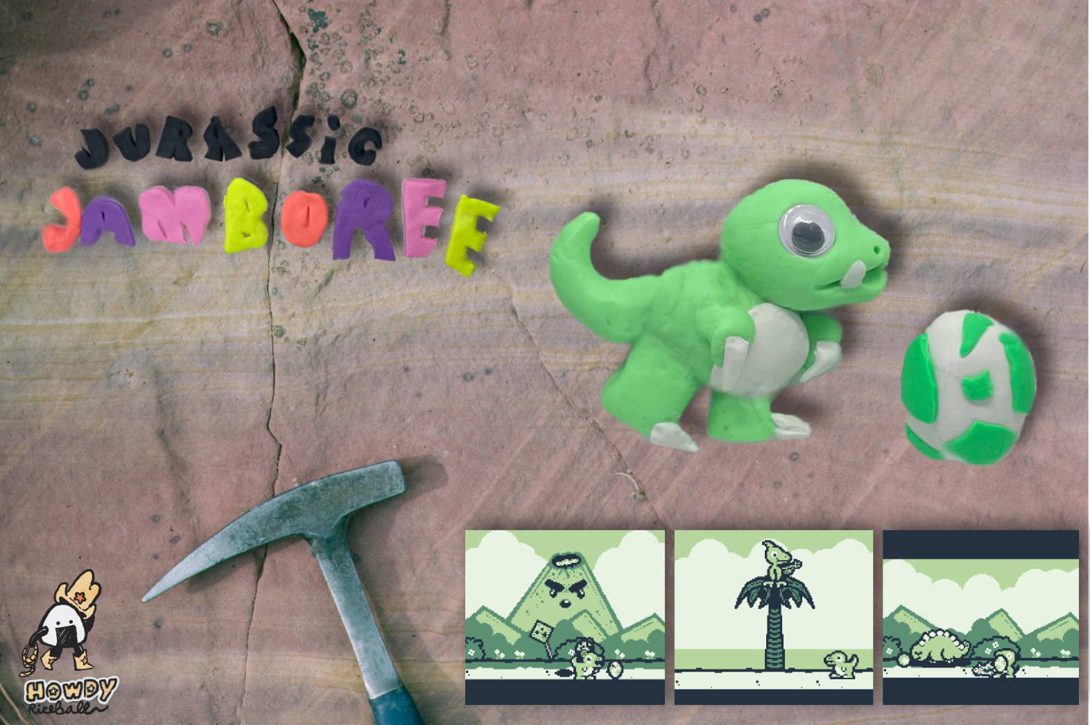
With that thought in mind, I landed on the following 2 backgrounds that gave me those good brain chemicals when I looked at them. They made me remember the feeling of being a little boy playing in some dirt hoping to dig up some dinosaur bones myself, if I just dug enough.


Well I had made progress for sure, but... now was time to start the real editing as these images were still pretty raw feeling.
Come back to see the result.
Files
Get Jurassic Jamboree (DEMO)
Jurassic Jamboree (DEMO)
Dust off your old gameboy to play this prehistoric discovery!
| Status | In development |
| Author | howdy riceball |
| Genre | Action |
| Tags | 16-bit, 8-Bit, Arcade, Dinosaurs, Game Boy, gbstudio, Pixel Art, Retro, Short, Singleplayer |
| Languages | English |
| Accessibility | Color-blind friendly |
More posts
- Korean Language Demo out now!Mar 14, 2023
- Dust off your Gameboy for this prehistoric discovery! (Part 3)Feb 02, 2023
- Making the clay promo art for the game. (Part One)Jan 19, 2023

Comments
Log in with itch.io to leave a comment.
Cool to see the process!
The first few backgrounds remind me of the early days of the Pokemon TCG with sets like Jungle and the Base Set featuring the Sugimori artwork on top of a somewhat-edited stock photo.
I think you made a good choice though with the ground textures and can relate to the memories of excavation :) To me, the scenes of nature are good for showcasing the lifestyle of a creature while the ground textures represent more of an unknown excitement to the viewer. It's like an invitation to dig deeper and discover all you can.
Looking forward to the next devlog!
I appreciate it Eric :D Now I wanna make a fake pokemon card of the rejected backgrounds haha. I love the card art on Pokemon cards way too much.
I agree about the scenes creating a lifestyle, I think if I ever do anything like that for the game I'd probably make the entire scene out of clay myself. Hope your dev adventures are going well, would love to play some more of your games :D
Thank you; looking to get back into dev-work soon!